An Angular Consultant’s Playbook: Connect Figma Tokens to PrimeNG/Angular with Storybook and Chromatic (Signals, Nx, A11y)
A production-ready pipeline for design tokens: export from Figma, map to PrimeNG CSS variables, drive Angular components with Signals, and gate changes with Chromatic.
Design tokens are your UX API. Treat them like code, test them like code, and ship them like code.Back to all posts
I’ve shipped token-driven design systems inside Fortune 100 dashboards where one pixel of drift means a three-day QA hold. If you’ve ever merged a small color tweak only to learn the PrimeNG DataTable spacing regressed on a kiosk at O’Hare, you know why a real pipeline matters. This article shows how I connect Figma tokens to Angular 20+ apps with PrimeNG, drive them at runtime with Signals/SignalStore, preview in Storybook, and lock quality with Chromatic—end to end, production-safe.
As enterprises plan 2025 roadmaps, this is where a senior Angular consultant earns their keep: one source of truth (Figma), one transform step (Style Dictionary/Nx), and one CI gate (Chromatic) that stops regressions before they land. Along the way, we’ll wire accessibility, typography, density controls, and the AngularUX color palette—without blowing performance budgets.
The Friday Afternoon Drift: Why Tokens Need CI
Token pipelines aren’t a designer-only exercise—they’re the contract between UX, engineering, and CI that keeps large Angular apps calm. We’ll anchor everything in Angular 20+, Signals, PrimeNG, Nx, and Storybook with Chromatic.
Symptoms you’ve likely seen
I’ve lived these in employee tracking portals, advertising analytics dashboards, and airport kiosks. Without a single token source of truth and visual regression gates, tiny CSS edits ripple across PrimeNG components.
Brand color off by 2% in production but not in Storybook
PrimeNG components styled with ad-hoc !important overrides
Design QA catching spacing regressions after merges
Kiosk screens flicker on theme switch; offline modes don’t pick up tokens
What we’re building
It’s boring in the best way: deterministic, typed, and measurable.
Figma → tokens.json (variables/semantics/components)
Style Dictionary → CSS vars, SCSS maps, typed TS module
Angular + PrimeNG → runtime Signals + variable mapping
Storybook + Chromatic → visual regression gates in CI
Why Figma→PrimeNG Tokens Matter for Angular 20+ Teams
If you need to hire an Angular developer or bring in an Angular consultant to stabilize a multi-brand UI, tokens are the shortest path to repeatable quality with measurable outcomes.
Lower change risk
When we tokenize, we reduce risky CSS patches and lean on generated artifacts. Chromatic enforces accuracy visually.
Single JSON source; codegen reduces hand edits
Chromatic blocks visual regressions before merge
Runtime UX controls
For role-based dashboards and white-labeled SaaS, tokens mean per-tenant themes with zero downtime.
Signals toggle density/typography instantly
Multi-tenant branding without redeploys
A11y and performance by default
We respect Core Web Vitals and avoid layout thrash by changing variables, not DOM structures.
Contrast tokens guard WCAG AA/AAA
CSS variables + Signals avoid heavy re-renders
How an Angular Consultant Approaches Figma→Angular Token Wiring
Below we wire exports, transforms, and PrimeNG mappings with Signals for runtime switching.
1) Shape tokens in Figma (Variables or Tokens Studio)
Agree on naming early. I mirror this hierarchy in code so devs can grep comfortably.
Organize into foundations (color/spacing/typography), semantics (primary/surface/success), and components (Button, Table, Chart)
Name tokens predictably: color.brand.primary.500, size.spacing.200, type.scale.body.md
2) Export tokens.json
Semantics are key—apps reference semantic tokens so foundations can change without touching components.
Use Tokens Studio export or Figma REST to JSON
Include modes: light, dark, high-contrast
Keep numeric scales consistent (50→900)
3) Transform with Style Dictionary (Nx task)
Multiple outputs let Angular, SCSS, and Storybook share a single truth without format wars.
Emit: tokens.css (CSS vars), tokens.scss (SCSS maps), tokens.ts (typed object)
Prefix CSS vars: --ux- for app, map to --p- for PrimeNG
Token Export and Style Dictionary Setup
Now every PR that touches tokens runs nx run design-system:build-tokens and publishes artifacts for Storybook and the app.
Sample tokens.json (AngularUX palette + density/typography)
{
  "$schema": "https://tokens.studio/schemas/1.0.0/tokens.schema.json",
  "color": {
    "brand": {
      "primary": {"50":"#eef6ff","500":"#1976d2","600":"#1565c0"},
      "accent": {"500":"#ff6f00"}
    },
    "surface": {"0":"#ffffff","100":"#f7f7f8","900":"#0b0e11"},
    "text": {"primary":"#111827","inverse":"#ffffff"},
    "status": {"success":"#16a34a","warning":"#f59e0b","danger":"#dc2626"}
  },
  "typography": {
    "fontFamily": {"base":"'Inter', system-ui, -apple-system, Segoe UI, Roboto, Helvetica, Arial"},
    "scale": {"sm":0.9, "md":1, "lg":1.12}
  },
  "density": {"compact":0.9, "comfortable":1, "spacious":1.15},
  "radius": {"sm":"4px","md":"8px","lg":"12px"},
  "elevation": {"1":"0 1px 2px rgba(0,0,0,0.06)","2":"0 4px 10px rgba(0,0,0,0.08)"}
}
style-dictionary.config.cjs
const StyleDictionary = require('style-dictionary');

module.exports = {
  source: ['tokens/tokens.json'],
  platforms: {
    css: {
      transformGroup: 'css',
      prefix: 'ux',
      buildPath: 'dist/tokens/',
      files: [{ destination: 'tokens.css', format: 'css/variables' }]
    },
    scss: {
      transformGroup: 'scss',
      buildPath: 'dist/tokens/',
      files: [{ destination: 'tokens.scss', format: 'scss/variables' }]
    },
    js: {
      transformGroup: 'js',
      buildPath: 'dist/tokens/',
      files: [{ destination: 'tokens.ts', format: 'javascript/es6' }]
    }
  }
}
Nx target for token build
{
  "name": "design-system",
  "targets": {
    "build-tokens": {
      "executor": "@nx/workspace:run-commands",
      "options": {
        "commands": [
          { "command": "node scripts/build-tokens.mjs" }
        ]
      },
      "outputs": ["{projectRoot}/dist/tokens"]
    }
  }
}
// scripts/build-tokens.mjs
import StyleDictionary from 'style-dictionary';
import config from '../style-dictionary.config.cjs';
StyleDictionary.extend(config).buildAllPlatforms();Map Figma Tokens to PrimeNG Variables
Minimal code, maximal leverage. Because we touch CSS variables, Angular change detection remains quiet—no extra renders, and Signals can update these at runtime.
PrimeNG theming overview
We align our --ux- variables to PrimeNG’s --p- variables in a lightweight theme layer.
PrimeNG uses CSS variables (e.g., --p-primary-color, --p-button-bg)
Themes like Lara/Aura read variables at runtime
SCSS bridge: --ux- → --p-
/* src/styles/primeng-bridge.scss */
@use 'dist/tokens/tokens.scss' as *; // generated

:root {
  /* Base mapping */
  --ux-color-brand-primary-500: #{map-get($color-brand-primary, 500)};
  --ux-color-text-primary: #{$color-text-primary};
  --ux-radius-md: #{$radius-md};

  /* PrimeNG mappings */
  --p-primary-color: var(--ux-color-brand-primary-500);
  --p-text-color: var(--ux-color-text-primary);
  --p-border-radius: var(--ux-radius-md);

  /* Density (multiplier applied in component styles) */
  --ux-density: 1;

  /* Typography scale */
  --ux-type-scale: 1;
}

.p-button { padding: calc(0.5rem * var(--ux-density)) calc(1rem * var(--ux-density)); }
.p-datatable .p-datatable-tbody > tr > td { padding: calc(0.75rem * var(--ux-density)); }
:root { font-size: calc(16px * var(--ux-type-scale)); }
PrimeNG pass-through and tokens
// example: override specific component vars using tokens
:root {
  --p-button-primary-background: var(--ux-color-brand-primary-500);
  --p-button-primary-border: var(--ux-color-brand-primary-600, var(--ux-color-brand-primary-500));
}
Runtime Switching with Signals and SignalStore
Signals keep runtime theme changes snappy—no extra component state or heavy change detection work. For real-time dashboards, this matters under load.
ThemeStore: centralize token state
// src/app/theme/theme.store.ts
import { signal, computed, effect, inject } from '@angular/core';
import { patchState, signalStore, withState } from '@ngrx/signals';

interface ThemeState {
  brand: 'angularux' | 'enterpriseA' | 'dark';
  density: 'compact' | 'comfortable' | 'spacious';
  typeScale: 'sm' | 'md' | 'lg';
}

export const ThemeStore = signalStore(
  withState<ThemeState>({ brand: 'angularux', density: 'comfortable', typeScale: 'md' })
);

export function provideTheme() {
  const store = inject(ThemeStore);

  const vars = computed(() => {
    const d = store.density();
    const t = store.typeScale();
    const brand = store.brand();
    // simple mappings; could be data-driven from tokens.ts
    const densityMap = { compact: 0.9, comfortable: 1, spacious: 1.15 } as const;
    const typeMap = { sm: 0.9, md: 1, lg: 1.12 } as const;
    const brandMap = {
      angularux: { primary: '#1976d2', accent: '#ff6f00' },
      enterpriseA: { primary: '#0052cc', accent: '#36b37e' },
      dark: { primary: '#60a5fa', accent: '#f59e0b' }
    } as const;

    return {
      '--ux-density': String(densityMap[d]),
      '--ux-type-scale': String(typeMap[t]),
      '--ux-color-brand-primary-500': brandMap[brand].primary,
      '--ux-color-brand-accent-500': brandMap[brand].accent
    } as Record<string, string>;
  });

  effect(() => {
    const root = document.documentElement;
    const map = vars();
    for (const [k, v] of Object.entries(map)) root.style.setProperty(k, v);
  });

  return store;
}
Signals for brand, density, and type scale
Applies CSS variable updates in a batch
Using ThemeStore in a component
@Component({
  selector: 'ux-theme-switcher',
  template: `
    <p-selectButton [options]="brands" [ngModel]="brand()" (onChange)="setBrand($event.value)"></p-selectButton>
    <p-selectButton [options]="densities" [ngModel]="density()" (onChange)="setDensity($event.value)"></p-selectButton>
  `
})
export class ThemeSwitcherComponent {
  store = provideTheme();
  brand = this.store.brand; density = this.store.density;
  brands = ['angularux','enterpriseA','dark'];
  densities = ['compact','comfortable','spacious'];
  setBrand(v:string){ patchState(this.store, { brand: v as any }); }
  setDensity(v:string){ patchState(this.store, { density: v as any }); }
}
Persisting preferences (Firebase optional)
In a retail kiosk rollout, we synced density and HC theme via Firebase so field devices remained consistent even after offline intervals.
Write theme prefs to Firestore or Remote Config
Restore on load for consistent UX across devices
Storybook Wiring and Controls
With tokens loaded globally, stories reflect the real theme. Controls let designers validate spacing and typography without calling a dev.
Install and configure
nx g @nx/angular:storybook-configuration app-shell --generateStories --configureCypress
pnpm add -D @storybook/angular@8 @storybook/addon-essentials chromatic
Load tokens, bridge, and global decorators
// .storybook/preview.ts
import '../src/styles/primeng-bridge.scss';
import 'dist/tokens/tokens.css';
import { withThemeByClassName } from '@storybook/addon-themes';

export const decorators = [
  withThemeByClassName({
    themes: { light: 'theme-light', dark: 'theme-dark', hc: 'theme-hc' },
    defaultTheme: 'light'
  })
];

export const parameters = {
  controls: { expanded: true },
  a11y: { element: '#root' }
};
A token-aware PrimeNG Button story
// src/stories/button.stories.ts
import { Meta, StoryObj } from '@storybook/angular';
import { ButtonModule } from 'primeng/button';

const meta: Meta = {
  title: 'PrimeNG/Button',
  decorators: [
    moduleMetadata({ imports: [ButtonModule] })
  ],
  argTypes: {
    density: { control: 'radio', options: ['compact','comfortable','spacious'] },
    label: { control: 'text' }
  }
};
export default meta;

type Story = StoryObj<{ density:'compact'|'comfortable'|'spacious'; label:string }>

export const Primary: Story = {
  args: { density: 'comfortable', label: 'Save' },
  render: ({ density, label }) => ({
    template: `
      <div [attr.data-density]="density">
        <button pButton type="button" label="${label}"></button>
      </div>
    `,
    styles: [`
      [data-density="compact"] { --ux-density: .9 }
      [data-density="comfortable"] { --ux-density: 1 }
      [data-density="spacious"] { --ux-density: 1.15 }
    `]
  })
};
Chromatic in CI: Visual Regressions as a Merge Gate
Chromatic becomes a required status check. If you want an Angular expert to raise your design confidence without slowing merges, this is the lever.
GitHub Actions workflow
name: chromatic
on:
  pull_request:
    branches: [ main ]
jobs:
  chromatic:
    runs-on: ubuntu-latest
    steps:
      - uses: actions/checkout@v4
      - uses: pnpm/action-setup@v3
      - run: pnpm install --frozen-lockfile
      - run: pnpm nx run design-system:build-tokens
      - run: pnpm nx run app-shell:build-storybook
      - uses: chromaui/action@v1
        with:
          projectToken: ${{ secrets.CHROMATIC_PROJECT_TOKEN }}
          storybookBuildDir: dist/storybook/app-shell
          exitZeroOnChanges: false
          autoAcceptChanges: false
          onlyChanged: true
Thresholds and a11y
I require Chromatic to pass for every PR that touches tokens or SCSS. It has prevented countless regressions, especially in DataTable density and focus rings.
Set pixel thresholds conservatively (0.1–0.3%)
Enable Storybook a11y addon; document contrast tokens
Accessibility, Typography, Density, and the AngularUX Palette
Accessibility tokens aren’t a side quest—they’re in the same JSON as brand colors. Storybook should surface HC and reduced motion modes as first-class themes.
Contrast-first colors
:root {
  --ux-color-surface-0: #ffffff;
  --ux-color-text-primary: #111827; // 12.6:1 on white
  --ux-focus-ring: 2px solid #1d4ed8; // visible focus
}
:root.high-contrast {
  --ux-color-surface-0: #000;
  --ux-color-text-primary: #fff;
  --ux-focus-ring: 3px solid #ff0;
}
Use contrast pairs in tokens: text.onPrimary, text.onSurface
Keep AA 4.5:1 minimum; AAA for text-critical areas
Typography scale and readable fallbacks
:root { --ux-type-scale: 1; font-family: var(--ux-font-base, 'Inter', system-ui, -apple-system, Segoe UI, Roboto, Helvetica, Arial); }
@media (prefers-reduced-motion) { * { transition: none !important; animation-duration: 1ms !important; } }
Density controls without reflow chaos
Small multipliers preserve rhythm. In airline kiosks, compact density reduced scan times without hurting hit targets due to stable line-height.
Drive paddings with multipliers only
Avoid line-height side effects
Charting and Data Visualization with Tokens
Charts must obey the same tokens as buttons and tables. With Signals, runtime theme changes cascade to visualizations without full rerenders.
Highcharts/D3 color and font tokens
// Highcharts theme using tokens
import * as Highcharts from 'highcharts';

export function applyChartTheme() {
  const s = getComputedStyle(document.documentElement);
  Highcharts.setOptions({
    chart: { backgroundColor: s.getPropertyValue('--ux-color-surface-0').trim() },
    title: { style: { color: s.getPropertyValue('--ux-color-text-primary').trim(), fontFamily: s.getPropertyValue('--ux-font-base').trim() } },
    colors: [
      s.getPropertyValue('--ux-color-brand-primary-500').trim(),
      s.getPropertyValue('--ux-color-brand-accent-500').trim(),
      '#16a34a', '#f59e0b', '#dc2626'
    ]
  });
}
// D3 axis with tokenized text color
const color = getComputedStyle(document.documentElement).getPropertyValue('--ux-color-text-primary').trim();
d3.selectAll('.axis text').style('fill', color);Canvas/Three.js scenes
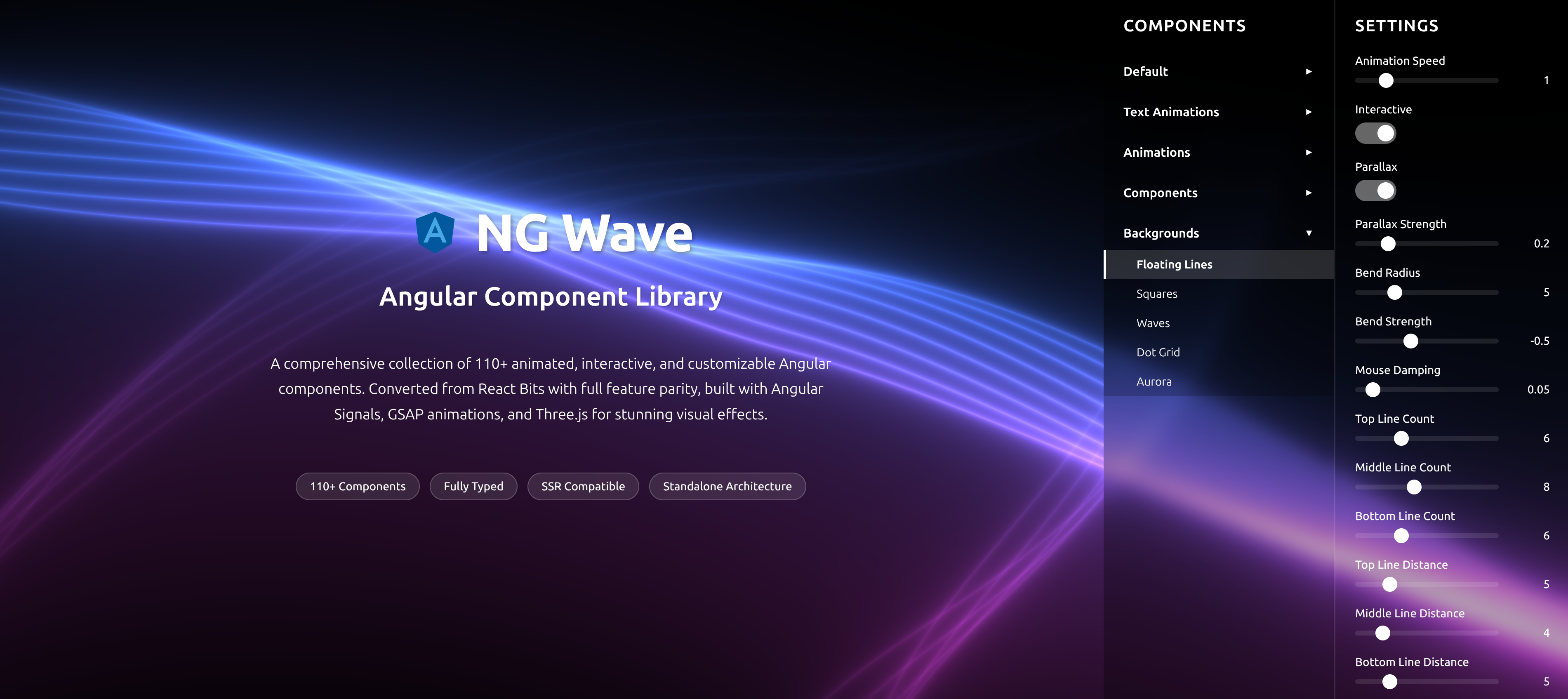
In telematics dashboards, tokenized color ramps kept heatmaps consistent between D3 and WebGL overlays. See the NG Wave demo for animated components aligned to tokens: Angular Signals and Three.js in action at the NG Wave component library.
Tokens drive background, gridlines, and highlight hues
Consistent typography in overlay UI
Example: PrimeNG Components Themed by Tokens
We keep behavioral polish—hover, active, focus—while staying inside the token system so Chromatic can police accidental shifts.
DataTable and Dialog
<p-table [value]="rows">
  <ng-template pTemplate="header">
    <tr>
      <th>Name</th>
      <th>Status</th>
    </tr>
  </ng-template>
  <ng-template pTemplate="body" let-row>
    <tr>
      <td>{{row.name}}</td>
      <td>
        <p-tag [style]="{background: 'var(--ux-color-brand-accent-500)', color: 'var(--ux-color-text-inverse, #fff)'}" [value]="row.status"></p-tag>
      </td>
    </tr>
  </ng-template>
</p-table>

<p-dialog header="Details" [modal]="true" [style]="{ '--p-border-radius': 'var(--ux-radius-md)'}"></p-dialog>
Focus, hover, and states
.p-focusable:focus { outline: var(--ux-focus-ring); outline-offset: 2px; }
.p-button:hover { filter: brightness(1.05); }
.p-button:active { transform: translateY(1px); }
Comparison: Which Tools, Where?
Pick the stack that fits your footprint. For data-dense enterprise dashboards (telecom ads analytics, VPS schedulers), PrimeNG plus tokens is hard to beat.
Figma→Angular token pipeline options
| Step | Option | Pros | Cons |
|---|---|---|---|
| Authoring | Figma Variables | Native, modes, fast | Limited export control |
| Authoring | Tokens Studio | Mature JSON schema, aliases | Plugin dependency |
| Transform | Style Dictionary | Multi-output, battle-tested | Config needed |
| Transform | Custom script | Full control | Maintenance burden |
| Delivery | CSS variables | Runtime theming, cheap | Type-safety lives elsewhere |
| Delivery | SCSS maps | Great for component SCSS | No runtime switching |
| Delivery | TypeScript | Strong typing, IDE discoverability | Must sync with CSS |
| QA | Chromatic | CI-ready, fast | Vendor service |
| QA | Storybook Test Runner | Open, code-oriented | Limited visual diffing |
| QA | Percy | Strong diffs | Paid tiers |
PrimeNG vs Material for tokenized theming (quick take)
| Criteria | PrimeNG | Angular Material |
|---|---|---|
| Component breadth | Very wide (DataTable, Scheduler, etc.) | Solid core set |
| CSS variable support | Strong in newer themes | Theming via tokens evolving |
| Pass-through styling | Yes | Limited |
| Enterprise data grid | Mature features | More basic |
| Fit for token pipelines | Excellent | Good |
When to Hire an Angular Developer for Token‑Driven Design Systems
Hiring an Angular expert for a short, surgical engagement often costs less than a quarter of the churn created by ad-hoc theming.
Signals you need help
I join as a remote Angular contractor to build the pipeline, wire a ThemeStore, and leave the team with docs, tests, and CI gates. Typical engagement: 2–4 weeks for retrofit, 4–6 for multi-brand rollouts.
Design drifts between Figma and prod every sprint
PrimeNG overrides pile up; CSS specificity wars ensue
Branding per tenant is manual and risky
Chromatic tests are missing or flaky
Expected outcomes
If you need an Angular consultant with Fortune 100 experience, I’m available for hire and can start a discovery call within 48 hours.
Chromatic gates prevent regressions
Density/typography switches without flicker
A11y contrast enforced by tokens
Measurable drop in CSS override diffs
Performance Budgets and Metrics
UX polish coexists with performance rigor; the trick is pushing changes through variables rather than component rerenders.
Budgets to set
// lighthouse-budgets.json
[
  {"path": "/*", "options": {"resourceSizes": [{"resourceType": "script", "budget": 170}]}},
  {"path": "/*", "options": {"timings": [{"metric": "interactive", "budget": 3500}]}}
]
Bundle: tokens+theme layer < 6 KB gzip
LCP < 2.5s on mid-tier mobile
Animation budget: <150ms transitions
Measure and enforce
Tokens should improve—not harm—performance. Signals + CSS vars are cheap, and Chromatic prevents visual rework.
Lighthouse in CI for key flows
Angular DevTools flame charts for render cost
GA4 custom dims for theme/density
Rollout Strategy and Zero Downtime
Zero downtime means cautious, instrumented flips—especially in kiosks or field devices where missed tokens can impede workflows.
Feature-flag tokens and bridge
I prefer a two-phase rollout: ship tokens and mapping with flags; test via Storybook embeds; flip tenants over one by one.
Ship bridge CSS behind Remote Config/feature flags
Dark launch stories in Chromatic first
Legacy rescue note
On legacy rescues, we layer tokens first, then refactor. See gitPlumbers to stabilize your Angular codebase before the token switch.
AngularJS/legacy JSP to Angular 20 tokenized themes
Zone.js cleanup and strict TS during retrofit
What to Instrument Next
An observable design system gives PMs and directors predictable velocity.
Telemetry and logs
Teams that watch their tokens ship safer. I also add a corridor test story that renders all critical components in each density mode.
Log theme switches to Firebase with tenant and role
Alert on Chromatic flake rate > 3%
Design debt register
Create a debt board—knock out hard-coded visuals over 2–3 sprints.
List of components still using hard-coded values
Plan to replace with semantic tokens
FAQ: Hiring and Technical Questions
Short, clear answers for common stakeholder and engineering questions.
How much does it cost to hire an Angular developer for this work?
Discovery is free; most token pipelines land between 2–6 weeks depending on scope. I work fixed-bid or time & materials as a remote Angular contractor.
How long does a Figma→PrimeNG token integration take?
A single-brand retrofit with Storybook and Chromatic typically ships in 2–4 weeks. Multi-tenant setups (3–5 brands) run 4–6 weeks including a11y hardening.
Do we need Nx to do this?
No, but Nx makes token builds and Storybook targets easy to wire into CI. I’ve run the same pipeline in plain Angular CLI and in monorepos.
Will runtime theming hurt performance?
No. Signals + CSS variables avoid component churn. In production dashboards I’ve kept frame stability while swapping themes live.
Can this work with Material or custom components?
Yes. The bridge maps tokens to any CSS variable contract. I’ve applied it to Angular Material, D3/Highcharts, and custom Three.js overlays.
Key takeaways
- Design tokens are the single source of truth for Angular 20+ visual language—export once from Figma, transform with Style Dictionary, and consume across CSS, TS, and Storybook.
- PrimeNG’s CSS variable-based theming makes token mapping straightforward; use runtime Signals to switch density, typography, and brand colors without app restarts.
- Storybook + Chromatic in CI enforce visual quality; snapshot diffs gate merges and protect accessibility and contrast tokens from regressions.
- A ThemeStore (SignalStore) cleanly orchestrates tokens, runtime toggles, and PrimeNG variable updates with minimal change detection overhead.
- Measure the UX: Lighthouse, Core Web Vitals, Angular DevTools flame charts, and Chromatic thresholds ensure polish never blows the performance budget.
Implementation checklist
- Export tokens from Figma (Variables or Tokens Studio) as JSON (base/semantics/components).
- Transform with Style Dictionary to CSS variables, SCSS maps, and a typed TypeScript token module.
- Map tokens to PrimeNG variables and create density/typography/focus-ring tokens.
- Build a ThemeStore (Signals) to swap brands and densities at runtime with zero flicker.
- Wire tokens into Storybook; add controls for theme, density, and typography scale.
- Enable Chromatic in GitHub Actions with thresholds and required status checks.
- Add a11y: contrast checks, focus tokens, prefers-reduced-motion, and HC themes.
- Instrument everything: Lighthouse budgets, bundle size, GA4 custom dims for theme, and Firebase logs for runtime swaps.
Questions we hear from teams
- How much does it cost to hire an Angular developer for token-driven theming?
- Most pipelines take 2–6 weeks depending on brands and components. I offer fixed-bid or T&M. Discovery call within 48 hours; estimate after a 1–2 day assessment.
- What does an Angular consultant actually deliver here?
- A Figma→code pipeline (Style Dictionary), PrimeNG bridge, ThemeStore with Signals, Storybook with controls, Chromatic CI gates, and docs. Optional Firebase persistence and analytics.
- How long does it take to connect Figma tokens to PrimeNG?
- Single brand: 2–4 weeks. Multi-tenant with a11y modes: 4–6 weeks. Visual regression gates run from day one to prevent drift.
- Will Chromatic slow down our merges?
- Chromatic runs in parallel CI and blocks only when there’s a real diff. It typically saves hours of manual QA per sprint by catching spacing and color regressions early.
- Can we roll out tokens without downtime?
- Yes. Ship the bridge behind a feature flag, verify in Storybook/Chromatic, then flip tenants progressively. I use Nx, GA4, and Firebase logs to monitor and roll back safely.
Ready to level up your Angular experience?
Let AngularUX review your Signals roadmap, design system, or SSR deployment plan.
NG Wave
Angular Component Library
A comprehensive collection of 110+ animated, interactive, and customizable Angular components. Converted from React Bits with full feature parity, built with Angular Signals, GSAP animations, and Three.js for stunning visual effects.
Explore Components