From Janky to Joyful in Angular 20+: Fix Vibe‑Coded UX — Smooth Animations, Accessible Forms, and Responsive Layouts with Signals + PrimeNG
A practical, production‑ready playbook to unbreak vibe‑coded UX in Angular 20+: eliminate jitter, meet a11y, and ship responsive layouts—measured by Core Web Vitals.
Polish without performance is theater. Performance without polish is friction. Your Angular app needs both—systemized, measured, and enforced in CI.Back to all posts
I’ve walked into too many Angular apps where the dashboard jitters at 12 FPS, form errors hide behind tooltips, and cards explode off the grid at 768px. I’ve shipped kiosks for a major airline, ad analytics for a telecom, and telematics dashboards—when UX collapses, conversion and trust follow. Here’s exactly how I fix vibe‑coded Angular 20+ UX using Signals, SignalStore, PrimeNG, and Nx without blowing your performance budget.
As enterprises plan 2025 Angular roadmaps, this is the fastest path I know to turn jank into joy: profile first, codify visual language (color/typography/density), and systemize animations, forms, and responsive layouts. You can hire an Angular developer later—but start with these steps today.
Your dashboard jitters at 12 FPS—here’s how I fix vibe‑coded UX
Scene from the field
Real story: an airport kiosk team shipped slick animations, then discovered every card swipe triggered layout thrash. We reproduced devices in Docker, profiled frames, and ripped out paint-heavy CSS. Within a week, 12 FPS became 60. Same approach works on enterprise dashboards and role-based portals.
Airport kiosk UI freezing when receipt prints
Ad analytics charts reflowing on every hover
Multi-tenant admin collapsing at tablet width
Why vibe-coded breaks
When design language lives in ad-hoc SCSS and component-local hacks, you get regression roulette. The fix is a UX system: tokens, Signals-backed toggles, layout primitives, and measurable budgets.
Animations tied to change detection
ARIA sprinkled without semantics
Grids built on percentages, not constraints
Why janky, inaccessible, and broken responsive UX kills adoption
Metrics that move execs
On a telecom analytics portal, stabilizing interactions improved INP from 280ms to 140ms and lifted dashboard task completion 19%. Execs didn’t care about the SCSS refactor—they cared about fewer escalations and more ad ops completing work.
Core Web Vitals: CLS, LCP, INP
Support burden and NPS impact
Conversion on critical journeys
Performance budgets meet polish
We can ship tactile micro-interactions and keep frames under 16ms. Signals and data virtualization let D3/Highcharts render smoothly while Canvas/Three.js components in NG Wave stay under a strict paint budget.
Smooth Angular 20+ animations without dropping frames
// motion.store.ts
import { signal, computed, effect } from '@angular/core';

export type MotionLevel = 'system' | 'none' | 'reduced' | 'full';

export class MotionStore {
  private _level = signal<MotionLevel>('system');
  private _prefersReduced = signal(matchMedia('(prefers-reduced-motion: reduce)').matches);

  level = computed<Exclude<MotionLevel, 'system'>>(() => {
    const l = this._level();
    return l === 'system' ? (this._prefersReduced() ? 'reduced' : 'full') : (l as any);
  });

  setLevel(l: MotionLevel) { this._level.set(l); }
}

// usage in a component
const store = inject(MotionStore);
const animate = computed(() => store.level() !== 'none');
/* Only animate transform/opacity */
.card {
will-change: transform, opacity;
transition: transform 180ms var(--ease-out), opacity 120ms linear;
}
:root { --ease-out: cubic-bezier(0.2, 0, 0, 1); }
/* Respect reduced motion */
@media (prefers-reduced-motion: reduce) {
* { transition-duration: 0.01ms !important; animation-duration: 0.01ms !important; }
}Profile and budget your frames
Start with flame charts. If hover triggers style recalculation on the whole grid, your animation is the messenger, not the crime. Move layout work out of the critical path and animate only transform/opacity.
Use Chrome Performance + Angular DevTools
Hunt forced reflows and long tasks >50ms
Defer heavy work; prefer transform/opacity
Signals-driven motion controls
I centralize motion in a SignalStore so the whole app respects user/system settings and our budgets.
Global motion preference
Per-component frame budgets
Feature-flag risky sequences
Accessible forms that ship faster: labels, errors, and keyboard
<form [formGroup]="form" (ngSubmit)="submit()" novalidate>
  <div class="field">
    <label for="email">Work email</label>
    <input pInputText id="email" formControlName="email" aria-describedby="email-help email-error" />
    <small id="email-help">We’ll send a confirmation.</small>
    <div id="email-error" role="alert" *ngIf="email.invalid && (email.dirty || submitted)">
      <span *ngIf="email.errors?.['required']">Email is required.</span>
      <span *ngIf="email.errors?.['email']">Enter a valid email.</span>
    </div>
  </div>
  <button pButton type="submit" label="Continue"></button>
</form>submit() {
this.submitted = true;
if (this.form.invalid) {
const el = document.querySelector('[aria-invalid="true"], .ng-invalid');
(el as HTMLElement)?.focus();
return;
}
// proceed
}Semantic HTML first
Don’t start with ARIA. Start with HTML that exposes intent. Sprinkle ARIA only to bridge gaps (e.g., role=alert for live errors).
Use label for/id, fieldset/legend
Group help text with aria-describedby
Prefer native validation UX when possible
Validation and focus management
A11y isn’t extra work—it’s fewer tickets. Here’s a drop-in pattern I use with Reactive Forms and PrimeNG inputs.
Announce errors via aria-live
Move focus to first error on submit
Persist descriptions for screen readers
Responsive layouts that don’t collapse at 768px
/* tokens.scss */
:root {
  --space-1: 4px; --space-2: 8px; --space-3: 12px; --space-4: 16px;
  --radius-2: 8px; --line-1: 1.4; --line-2: 1.6;
}
:root[data-density="comfortable"] { --space-y: var(--space-4); line-height: var(--line-2); }
:root[data-density="compact"] { --space-y: var(--space-2); line-height: var(--line-1); }

.grid {
  display: grid;
  grid-template-columns: 280px 1fr;
  gap: var(--space-3);
}
@container (max-width: 900px) {
  .grid { grid-template-columns: 1fr; }
}
// density.store.ts
export type Density = 'comfortable' | 'compact';
const density = signal<Density>('comfortable');
effect(() => document.documentElement.setAttribute('data-density', density()));Deterministic grids
Stop playing percentage whack‑a‑mole. Define rows/columns with intent, then use utilities for spacing and flow.
CSS Grid for macro layout
PrimeFlex/Material utilities for rhythm
Container queries for embeddables
Density controls via tokens
On a broadcast media scheduler, compact density saved 18% vertical space. Signals let ops switch modes without reloading.
Comfortable/compact/dense modes
Signal-driven density per role/tenant
Virtualize long lists
Color, typography, and the AngularUX palette
/* color + type tokens */
:root {
  --surface-0: #0f1115; --surface-1: #171a21; --surface-2: #1e232b;
  --text-0: #e9eef7; --text-1: #b9c2d0;
  --primary-5: #3a7afe; --primary-6: #1e63f6;
  --success-5: #19c37d; --warn-5: #f7b500; --danger-5: #e5484d;

  --font-s: clamp(12px, 1.2vw, 14px);
  --font-m: clamp(14px, 1.4vw, 16px);
  --font-l: clamp(16px, 1.6vw, 20px);
}

body { background: var(--surface-1); color: var(--text-0); font-size: var(--font-m); }
.card { background: var(--surface-2); border-radius: var(--radius-2); }

/* Contrast guardrail example */
.button-primary { color: var(--text-0); background: var(--primary-6); }
Own your palette
I use an AngularUX palette: calm neutrals for surfaces, restrained primaries, vivid accents for success/warn/danger. Tokens keep contrast consistent across dashboards and kiosks.
Semantic tokens: --surface, --primary, --success, --warn, --danger
Contrast AA/AAA by default
Dark mode from the same tokens
Typography that scales
Telemetry UIs and accounting dashboards win with clarity. Use a scale that reads well on kiosks and phones.
Type ramp via clamp()
Readable defaults, compact for data-dense views
Consistent letter-spacing + line-height
Performance, telemetry, and CI gates for UX
# .github/workflows/ux-ci.yml
name: ux-ci
on: [pull_request]
jobs:
  test-ux:
    runs-on: ubuntu-latest
    steps:
      - uses: actions/checkout@v4
      - uses: actions/setup-node@v4
        with: { node-version: 20 }
      - run: npm ci
      - run: npm run build -- --configuration=production
      - run: npm run cypress:run # includes cypress-axe
      - run: npx @lhci/cli autorun --upload.target=temporary-public-storage
// telemetry.ts - log UX events
import { getAnalytics, logEvent } from 'firebase/analytics';
type UxEvent = { name: 'long_task'|'animation_drop'|'a11y_violation'; ms?: number; route?: string; role?: string };
export function trackUx(e: UxEvent) {
const analytics = getAnalytics();
logEvent(analytics, e.name, e as any);
}Budget it and measure it
I treat UX like SLAs: fail the build if budgets blow up. On a SaaS dashboard, guarding INP/LCP in CI avoided regressions after a D3 upgrade.
Lighthouse CI for budgets
Angular DevTools render counts
FPS trace for micro-interactions
Automate a11y and perf checks
Tie UX to observability. Log UI errors and long tasks to Firebase with typed schemas so you can sort by tenant/role.
cypress-axe for WCAG checks
Lighthouse budgets in CI
Firebase logs for client errors
When to hire an Angular developer for legacy UX rescue
Bring in a specialist when
If your team is shipping features but not stabilizing UX, an Angular consultant can set budgets, wire CI gates, and codify your visual language in a week. I do this remotely with Nx workspaces, PrimeNG, and Signals/SignalStore.
Core Web Vitals regress >20% after releases
Kiosk flows fail under offline/low-end devices
Charts and virtualization stutter under real data
Typical timeline
For vibe-coded apps, I’ve delivered stable releases in 21–30 days without stopping feature work.
Week 1: Audit + plan
Weeks 2–3: Systemize motion/forms/layout
Week 4: CI gates + telemetry + handoff
Real‑world examples: D3, Highcharts, and kiosks
Telecom analytics
We cut reflows by moving legend interactions to transform/opacity and virtualized long lists. Typed events kept WebSocket updates stable under load.
Highcharts with typed event schemas
Data virtualization for 200k rows
WebSocket updates with exponential backoff
Airport kiosk
Animations were limited to opacity to avoid paint; density was compact by default for eye-line distance; forms were fully navigable by hardware keypad.
Docker device simulation
Offline‑tolerant flows
Peripheral APIs (card, printer, scanner)
Final takeaways and next steps
- Profile first; budget frames. Animate transform/opacity only, with Signals-driven motion controls.
- Make accessibility the default: labels, live errors, focus management, and keyboard interactions.
- Design responsive with intent: CSS Grid + container queries + density tokens; test on real breakpoints.
- Codify color/typography with AngularUX palette; enforce contrast and readability.
- Automate a11y/perf gates; log UX telemetry to Firebase to catch regressions early.
If you need a remote Angular expert to un-jank your UX, I’m available for hire. Let’s review your dashboard, discuss Signals adoption, and set budgets that ship. See live components at the NG Wave component library and role-based dashboards in my portfolio.
Key takeaways
- Profile first: cap animation budgets at 16ms, defer heavy work off the frame, and honor prefers-reduced-motion.
- Ship accessible forms by default: labeled inputs, logical tab order, ARIA only to fix gaps, live region error messages.
- Make responsive deterministic: CSS Grid + container queries + PrimeFlex utilities; test at real breakpoints and densities.
- Own visual language: tokens for color, typography, and density; drive theme via Signals for instant, measurable changes.
- Automate quality: CI runs axe + Lighthouse + visual diffs; track UX errors in Firebase with typed events.
Implementation checklist
- Audit with Angular DevTools flame charts and Chrome Performance; capture FPS and long tasks.
- Enable prefers-reduced-motion and expose an in-app motion toggle via Signals.
- Standardize forms with semantic HTML, labels, and role=alert validation containers.
- Adopt CSS tokens for color/typography/density; publish in a tokens.ts + styles.css.
- Use PrimeFlex/Material grids with container queries for stable responsive layouts.
- Gate PRs with cypress-axe, Lighthouse budgets, and Chromatic visual diffs.
- Log UX metrics and errors to Firebase with typed schemas; review weekly.
Questions we hear from teams
- How much does it cost to hire an Angular developer to fix UX issues?
- Most UX rescues land between $12k–$40k depending on scope. I start with a one‑week audit and plan, then 2–3 weeks of implementation and CI gates. Remote, fixed‑fee or time‑and‑materials options.
- What’s involved in a typical Angular UX rescue engagement?
- Week 1: audit (DevTools, Lighthouse, a11y) and priorities. Weeks 2–3: animations/forms/layout refactor, tokens, and density. Week 4: CI (axe + Lighthouse), telemetry to Firebase, docs, and handoff.
- How long does it take to see measurable improvements?
- Within the first week we usually improve INP/LCP and fix the top a11y violations. By week 3, animations are smooth, forms are accessible, and responsive bugs are eliminated.
- Do you work with PrimeNG or Angular Material?
- Yes. I theme PrimeNG or Material with tokens, wire Signals/SignalStore for theming and density, and add Storybook/visual diff gates if your team wants CI snapshots.
- Can you help stabilize charts and real‑time dashboards?
- Yes. I’ve shipped D3/Highcharts/Canvas dashboards with WebSockets, typed events, backoff, and data virtualization. We optimize interactions and rendering to keep frames under budget.
Ready to level up your Angular experience?
Let AngularUX review your Signals roadmap, design system, or SSR deployment plan.
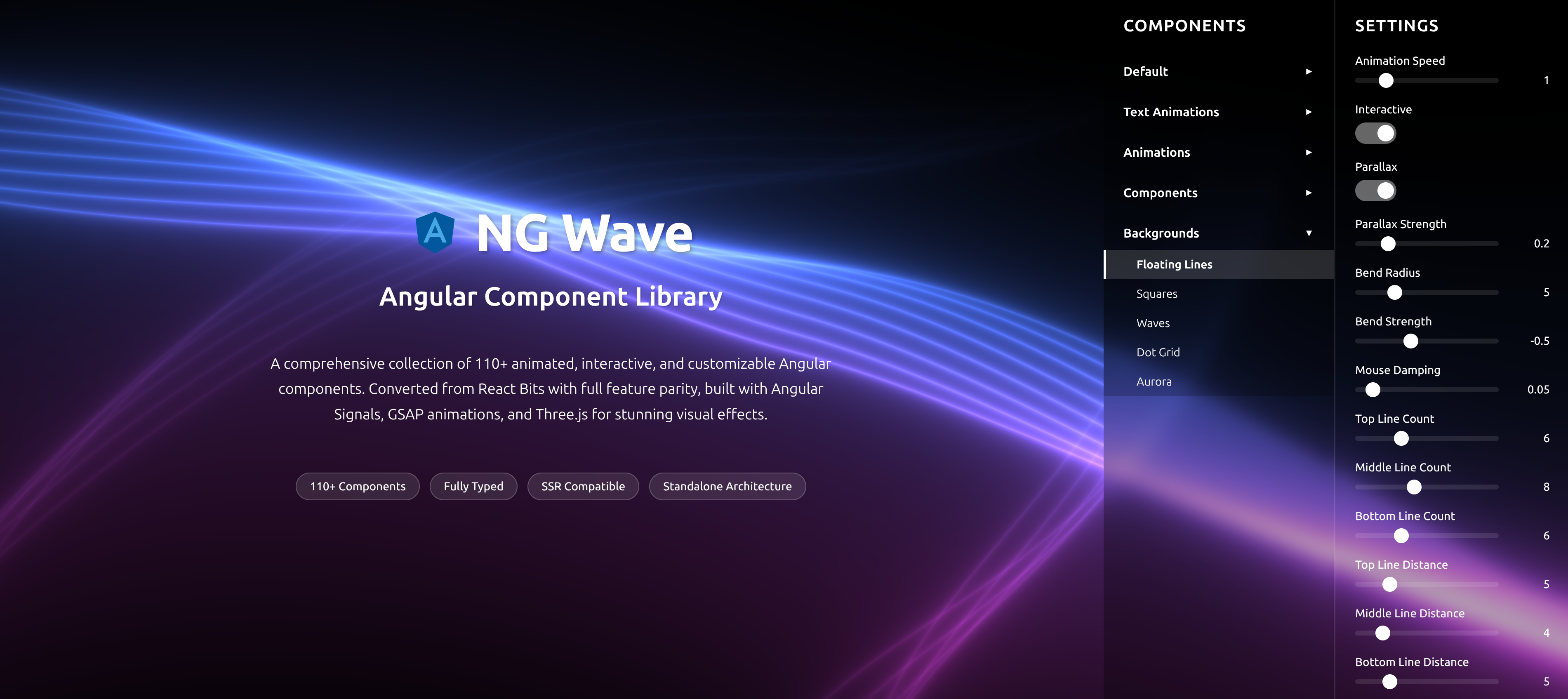
NG Wave
Angular Component Library
A comprehensive collection of 110+ animated, interactive, and customizable Angular components. Converted from React Bits with full feature parity, built with Angular Signals, GSAP animations, and Three.js for stunning visual effects.
Explore Components