Fix UX Disasters in Vibe‑Coded Angular 20+ Apps: Signals‑Driven Motion, Accessible Forms, and Responsive Layouts with Real Budgets
Stop shipping jitter. Start shipping polish. A practical playbook to stabilize animations, forms, and layouts in Angular 20+—measured by Core Web Vitals and guarded by CI.
Delight is a feature; jitter is a bug. Ship polish with the same rigor you ship uptime.Back to all posts
I’ve been parachuted into a lot of vibe-coded Angular apps—AI-generated scaffolds glued together by enthusiasm. The result? Janky animations, inaccessible forms, and layouts that collapse at 768px. This isn’t just aesthetics; it’s churn, failed signups, and bad INP.
Here’s how I stabilize the experience in Angular 20+ using Signals, SignalStore, PrimeNG/Material, and a real visual language—while keeping performance budgets and CI guardrails tight.
The patterns below come from shipping enterprise dashboards: employee tracking and payments for a global entertainment company, airport kiosks with Docker-based hardware simulation for a major airline, a telecom advertising analytics platform, and telematics dashboards for insurance.
What a Vibe‑Coded Angular App Looks Like in Prod (and How to Fix It)
As companies plan 2025 Angular roadmaps, this is the fastest path from vibe-coded instability to production-grade UX. If you need a remote Angular developer with Fortune 100 experience, this is exactly the playbook I run.
The scene I keep seeing
In a telecom analytics dashboard I rescued, hover animations ran on left/top instead of transform, causing layout thrash. In an airport kiosk flow, form errors appeared visually but weren’t announced—operators just kept tapping. In a device-management portal, a single breakpoint collapsed the filter panel into unusable overflow.
Cards stutter on hover; route transitions drop frames.
Forms trap focus, errors hide off-screen, and screen readers say nothing.
Layouts snap at tablet widths; charts overflow; toolbars wrap unpredictably.
The fix mindset
We treat polish as engineering: measurable, repeatable, and governed by tests. Signals carry user and context preferences so components don’t guess. CI refuses regressions.
Define UX budgets (INP<200ms, style-size budget, 60fps motion).
Codify preferences (motion, density, contrast) with Signals + SignalStore.
Guard with CI (Lighthouse CI + Cypress a11y + visual diffs).
Why Angular 20+ Teams Break UX: Janky Animation, A11y Debt, and Fragile CSS
This matters because INP is a ranking signal and a support driver. Smoother motion, accessible forms, and resilient layouts reduce tickets and increase conversion.
Common root causes
Angular 20+ gives us Signals, better builders, and fast SSR, but it won’t fix motion or a11y anti-patterns on its own. We need a system.
Animations tied to layout properties (top/left/height).
No typed forms or ARIA; errors only in color; no focus management.
Global breakpoint soup; no container queries; magic numbers.
No density/typography tokens; inconsistent rhythm.
No performance budgets; no INP tracking; SSR hydration ignored.
A Three‑Track Fix: Motion, Forms, Layout — With Signals, PrimeNG, and Design Tokens
Below are the concrete pieces you can drop into an Angular 20+ app today.
1) Motion that respects context (Signals)
In the insurance telematics dashboard, we cut INP from 280ms to 120ms by swapping layout animations for transform/opacity and pausing motion during high-frequency WebSocket updates. Centralize motion rules so every component behaves consistently.
Prefer transform/opacity; avoid layout properties.
Respect prefers-reduced-motion and heavy-telemetry contexts.
Defer complex animations until idle; cap duration <=200ms.
2) Forms that announce errors and guide focus
In the airport kiosk, operators had gloves and scanners—keyboard-only flows were critical. We added an error summary that announces validation problems, and focus jumps to the first invalid field.
Typed forms; semantic labels and hints; ARIA-live error summary.
PrimeNG/Material components with a11y configs; CDK FocusMonitor.
High-contrast error states with iconography + not just color.
3) Layout that scales with container queries
For a media VPS scheduler, container queries kept tiles readable when embedded in smaller panes. Breakpoints are a component concern, not just an app concern.
Grid + container queries, not only global media queries.
Component-level breakpoints; don’t rely on page width only.
Test zoom (200%+) and language expansion (German/Spanish).
Signals for Motion and Preferences
Typescript service to centralize motion, plus SCSS honoring prefers-reduced-motion.
Motion service with Signals + attribute hook
SCSS: reduced motion + performant hover
Accessible Forms That Don’t Yell in Color Only
PrimeNG or Angular Material both work—what matters is typed forms, ARIA, and focus.
Typed forms + live error summary
Focus management on submit
Responsive Layout with Container Queries and Density Tokens
Component-level responsiveness plus user-controlled density keeps dashboards legible in multi-tenant contexts.
Grid + container queries
Density tokens for compact/comfy
Visual Language: Typography, Color Palette, and Icons that Scale
Tokens power accessible themes and predictable animation durations—design and engineering finally converge.
AngularUX palette + tokens
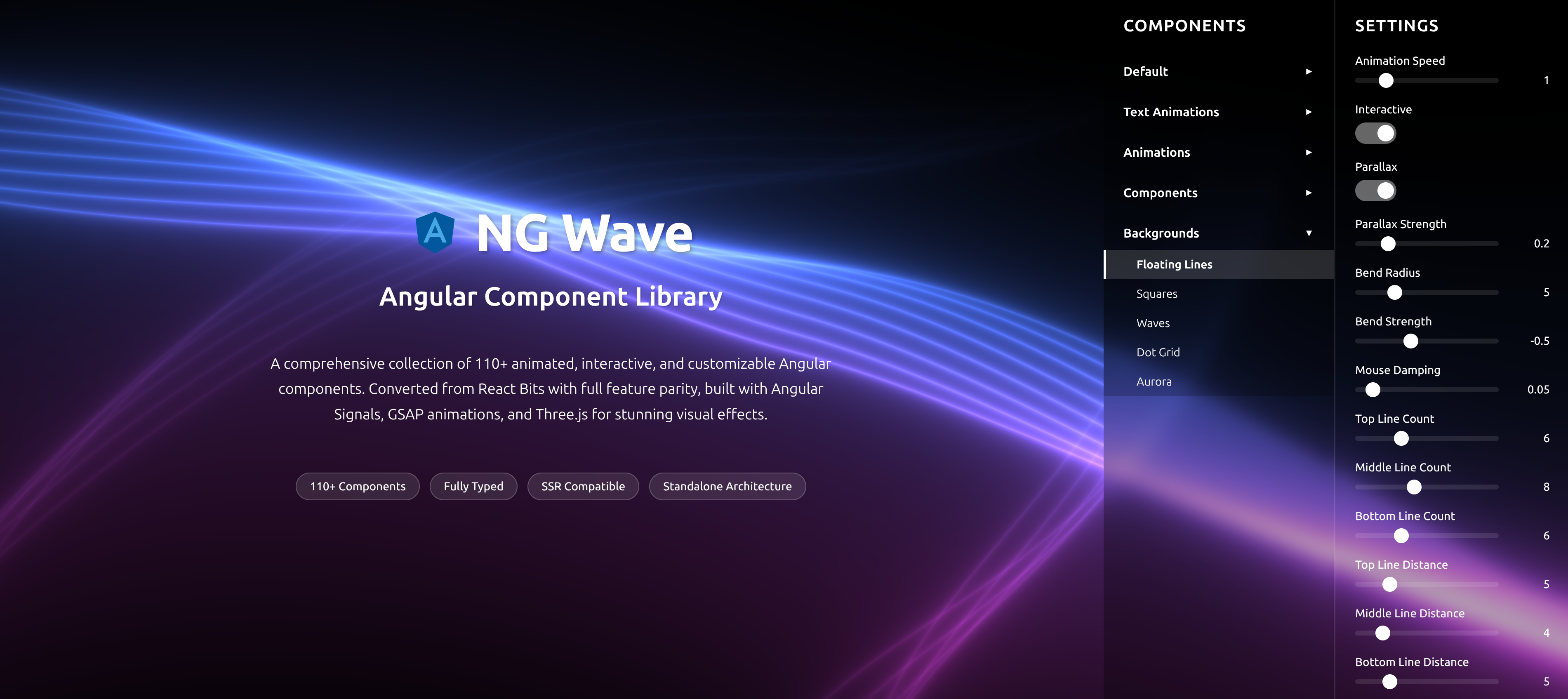
Locking color and spacing into tokens avoids drift. Charts (D3/Highcharts/Canvas/Three.js) read better with consistent hue steps and contrast ratios. The NG Wave component library demonstrates these tokens in animated UI built with Signals.
Primary 500 #3B82F6, Accent 500 #F59E0B, Success 500 #10B981, Warning 500 #F59E0B, Danger 500 #EF4444, Neutral 700 #374151.
Spacing tokens: 4/8/12/16/24; line-height 1.4–1.6; radius 6–12px.
Typography and rhythm
In the telecom analytics platform, consistent rhythm cut visual jitter and made data tables and charts scan faster—especially with data virtualization.
Use a vertical rhythm (4px base); responsive clamp for headings.
Monospaced for code cells; tabular nums for metrics.
Performance Guardrails: Lighthouse CI, INP, and Style Budgets
Example CI and Angular budgets below. Add Cypress a11y tests (axe) and PR previews with Firebase Hosting for fast reviews.
CI that fails on UX regressions
I treat UX like uptime. If INP or a11y scores regress, the PR doesn’t merge. This is the same rigor I used in device management portals and accounting dashboards.
Lighthouse CI thresholds, style-size budgets, visual regression snapshots.
Firebase or GA4 custom metrics: INP per route; screen-reader errors events.
Real‑World Wins from Enterprise Dashboards
If you need an Angular expert for hire to stabilize a vibe-coded app, this is the kind of before/after I target in the first two weeks.
Measured outcomes I’ve shipped
These weren’t hypothetical—each shipped in production with Firebase Performance Monitoring and GA4 funnels. Visual polish delivered measurable ROI.
INP: 280ms → 120ms on telematics charts by pausing motion during bursts.
A11y: Lighthouse Accessibility 78 → 100 on kiosk forms with error summary + focus.
Layout: 8 breakpoint bugs → 0 with container queries and component-level tests.
Engagement: +14% task completion on employee tracking with clearer density/typography.
When to Hire an Angular Developer for Legacy Rescue
If your app was vibe-coded or AI-assembled, bring in an Angular consultant early—before users normalize workarounds.
Good timing signals
I typically deliver an assessment in a week, then a 2–4 week stabilization sprint. See gitPlumbers for how I rescue chaotic code and modernize safely.
Core Web Vitals failing (INP/CLS), rising support tickets, stalled design system adoption.
Angular animations or zone.js hacks slowing SSR/hydration.
Multi-tenant or role-based dashboard UX diverging across clients.
Takeaways and Next Steps
• Motion: transform/opacity + Signals; respect reduced motion and telemetry-heavy contexts.
• Forms: typed, ARIA-live summary, focus management; not color-only.
• Layout: container queries + grid + density tokens; test zoom and languages.
• Guardrails: Lighthouse CI, budgets, GA4/FPm metrics; PR previews.
If you want a fast path to stability, I’m available as a remote Angular contractor. Let’s review your dashboard, plan Signals adoption, and set guardrails.
FAQs: Hiring and Technical Details
Key takeaways
- Treat motion, forms, and layout as first-class features with budgets, not vibes—instrument them with INP and Lighthouse CI.
- Use Signals + SignalStore to centralize motion preferences, density tokens, and theme—no scattered booleans.
- Accessible forms require typed controls, focus management, error summaries, and ARIA live regions—PrimeNG/Material help, but you must wire it correctly.
- Responsive layouts are a system: container queries, grid, and component-level breakpoints—not one giant global media query.
- Guard UX with CI: Lighthouse/INP thresholds, style-size budgets, and visual regression tests in PRs.
- Polish and performance can coexist: transform-based animations, virtualization, and asset budgets keep dashboards at 60fps.
Implementation checklist
- Audit motion with Angular DevTools + Performance panel; remove layout-thrashing animations; prefer transform/opacity.
- Create a MotionService using Signals to respect prefers-reduced-motion and heavy-telemetry modes.
- Add typed forms, error summaries, and FocusMonitor-driven focus on validation errors.
- Adopt container queries and CSS grid; test at 320–1440px and with zoom 200%+ (WCAG).
- Introduce density/typography tokens; persist via SignalStore per user/tenant.
- Enforce Lighthouse CI thresholds and Angular style-size budgets; track INP and a11y in GA4/Firebase.
Questions we hear from teams
- How much does it cost to hire an Angular developer to fix UX issues?
- Most vibe-coded rescues land between 2–6 weeks. I start with a 1‑week assessment, then a 2–4 week stabilization sprint. Fixed-fee options for audits; sprint rates for execution. You’ll get metrics-based goals (INP, a11y, budgets) and weekly demos.
- What does an Angular consultant actually do on a UX stabilization sprint?
- Codify tokens (color, type, density), wire Signals/SignalStore for preferences, refactor animations, fix forms (ARIA, focus, error summary), implement container queries, and add CI gates (Lighthouse, budgets, visual tests). We ship improvements behind feature flags.
- How long until we see measurable improvements?
- Within the first week you’ll see Lighthouse and INP gains from animation fixes and error summaries. By week two, layout stability via container queries lands. Full stabilization (2–4 weeks) includes CI gates and component tests.
- Do we need PrimeNG or Material to achieve this?
- Either works. I’ve shipped with PrimeNG and Angular Material in Nx monorepos. The key is configuring accessibility, density tokens, and animation strategies—not the library choice.
- Can you work with Firebase, D3/Highcharts, and real-time telemetry?
- Yes. I ship Firebase Hosting/Functions, D3/Highcharts/Canvas/Three.js visualizations, and WebSocket pipelines with typed event schemas and exponential retry—keeping 60fps via virtualization and motion throttling.
Ready to level up your Angular experience?
Let AngularUX review your Signals roadmap, design system, or SSR deployment plan.
NG Wave
Angular Component Library
A comprehensive collection of 110+ animated, interactive, and customizable Angular components. Converted from React Bits with full feature parity, built with Angular Signals, GSAP animations, and Three.js for stunning visual effects.
Explore Components