Fix UX Disasters in Vibe‑Coded Angular Apps: Smooth Animations, Accessible Forms, and Rock‑Solid Responsive Layouts
From jittery charts to forms that fail audits—how I stabilize vibe‑coded Angular 20+ apps with Signals, PrimeNG, and a measurable visual system.
“Vibe‑coded UI looks great in a screenshot. In production, rigor wins: Signals to tame motion, semantic forms, and a visual system you can test.”Back to all posts
I’ve been the cleanup crew for more Angular dashboards than I can count—telecom analytics, airline kiosks, insurance telematics, and employee tracking at a global entertainment company. The pattern is consistent: vibe‑coded UI looks fine on a Figma screenshot, then collapses under real data, real devices, and real users.
This article is a focused rescue plan for Angular 20+ teams: smooth out janky animations, make forms accessible (and testable), and lock responsive layouts so they don’t crack at 50k rows or a 12‑column KPI grid. We’ll use Signals/SignalStore, PrimeNG, and a small, measurable visual system that plays nice with performance budgets.
If you’re evaluating whether to hire an Angular developer or bring in an Angular consultant, this is how I approach UX debt without stopping delivery—and how we prove the wins with numbers, not vibes.
The dashboard that jitters when reality hits
Picture a live ops dashboard: WebSocket data spiking, Highcharts repainting, side‑nav collapsing, and a PrimeNG table reflowing on each update. I’ve seen charts vibrate, focus jump, and responsive grids snap because someone animated left/top and sprinkled !important everywhere.
As companies plan 2025 Angular roadmaps, you don’t need a redesign—you need rigor: Signals to control motion, a11y‑first forms, container‑query layouts, and tokens that keep visuals tight across PrimeNG and custom components.
Why vibe‑coded Angular apps break: animations, forms, and layouts
In a telecom analytics platform I shipped, render spikes were blamed on charts. The real culprit: nav animations thrashing layout during each tick. In a kiosk project for a major airline, inaccessible focus traps blocked paying customers when a device briefly went offline. These aren’t edge cases—they’re defaults when UX is vibe‑coded.
Symptoms I see in the field
Janky transitions that spike INP and visibly reflow
Forms that fail screen reader audits or trap focus
Layouts that collapse with role‑based panels or 50k rows
Root causes
Animating layout properties (top/left/height) instead of transform/opacity
No reduced‑motion strategy; timelines too long for micro‑interactions
Non‑semantic form markup and missing programmatic focus
Pixel‑locked breakpoints; no container queries or density scaling
Stop the jitter: animation patterns that hold
// motion.util.ts (Angular 20)
import { signal, effect } from '@angular/core';

export const prefersReducedMotion = (() => {
  const media = window.matchMedia('(prefers-reduced-motion: reduce)');
  const s = signal(media.matches);
  const onChange = () => s.set(media.matches);
  media.addEventListener?.('change', onChange);
  return s;
})();

// component.ts
import { Component, computed, signal } from '@angular/core';
import { trigger, transition, style, animate } from '@angular/animations';
import { prefersReducedMotion } from './motion.util';

@Component({
  selector: 'ux-collapsible',
  template: `
    <section [@collapse]="open() ? 'open' : 'closed'">
      <ng-content />
    </section>
    <button (click)="toggle()">Toggle</button>
  `,
  animations: [
    trigger('collapse', [
      transition('closed => open', [
        style({ transform: 'scaleY(0.98)', opacity: 0 }),
        animate('{{d}}ms ease-out', style({ transform: 'scaleY(1)', opacity: 1 }))
      ]),
      transition('open => closed', [
        animate('{{d}}ms ease-in', style({ transform: 'scaleY(0.98)', opacity: 0 }))
      ])
    ])
  ]
})
export class CollapsibleComponent {
  open = signal(false);
  duration = computed(() => prefersReducedMotion() ? 0 : 160);
  toggle = () => this.open.update(v => !v);
}
// Avoid layout thrash: transform + opacity only
:host section {
transform-origin: top;
will-change: transform, opacity;
}// Sampling jittery updates with Signals
import { signal, computed } from '@angular/core';
const rawRate = signal<number>(0); // e.g., incoming telemetry rate
let last = 0;
export const sampledRate = computed(() => {
const now = performance.now();
if (now - last > 66) { // ~15 fps
last = now;
return rawRate();
}
return rawRate.peek();
});Prefer transform and opacity
In Angular 20+, keep triggers minimal and data‑driven. Use Signals to short‑circuit motion when updates are frequent.
Avoid animating layout properties; use translate/scale/opacity for GPU paths
Cap micro‑interaction durations to ~120–200ms; ease‑out or standard curves
Honor reduced motion via Signals
This utility returns a signal that updates on OS preference changes and across tabs:
Single source of truth for prefers‑reduced‑motion
Gate triggers and heavy timelines with a signal
Throttle high‑frequency updates
In real‑time telematics, I sample visual updates to 10–15 fps while keeping data at full fidelity. Charts remain accurate; UI stays stable.
Debounce or sample animation triggers when telemetry floods in
Use SignalStore to coalesce updates across components
Forms that pass audits—and help users succeed
<form (ngSubmit)="onSubmit(form)" #form="ngForm" novalidate>
  <div id="error-summary" tabindex="-1" *ngIf="errors.length" class="error-summary" aria-live="polite">
    <h2>There’s a problem</h2>
    <ul>
      <li *ngFor="let e of errors"><a [href]="'#' + e.id">{{ e.message }}</a></li>
    </ul>
  </div>

  <div class="field">
    <label for="email">Email</label>
    <input id="email" name="email" type="email" [(ngModel)]="model.email"
           [attr.aria-describedby]="emailHintId"
           required/>
    <p [id]="emailHintId" class="hint">We’ll send a confirmation.</p>
    <p class="error" *ngIf="form.submitted && !model.email" aria-live="polite">Enter your email</p>
  </div>

  <button type="submit">Continue</button>
</form>
import { Component } from '@angular/core';
@Component({ selector: 'ux-form', templateUrl: './form.html' })
export class UxFormComponent {
model = { email: '' };
errors: { id: string; message: string }[] = [];
emailHintId = 'email-hint';
onSubmit(form: any) {
this.errors = [];
if (!this.model.email) this.errors.push({ id: 'email', message: 'Enter your email' });
if (this.errors.length) {
setTimeout(() => document.getElementById('error-summary')?.focus(), 0);
return;
}
// Proceed; announce success via live region or toast with role="status"
}
}This exact approach unblocked kiosk payments for a major airline when peripherals hiccupped; we could surface actionable errors, keep focus stable, and complete transactions offline until devices recovered.
Semantic markup + labels
Use label for/id, fieldset/legend for groups, and role consistency
Associate helper/error text via aria‑describedby
Error patterns and focus
Here’s a minimal pattern I deploy across PrimeNG and Material forms:
On submit, send focus to error summary and persist landmarks
Use aria‑live polite for inline errors; avoid focus steal on keystroke
Keyboard and screen reader support
Ensure tab order, skip links, and success announcements
For multi‑step, expose step count and current step via aria‑current
Responsive layouts that don’t crack under real data
/* tokens.scss */
:root {
  --ux-space-1: 0.25rem;
  --ux-space-2: 0.5rem;
  --ux-space-3: 1rem;
  --ux-type-scale-0: clamp(12px, 0.8vw, 14px);
  --ux-type-scale-1: clamp(14px, 0.9vw, 16px);
  --ux-type-scale-2: clamp(18px, 1.2vw, 20px);
}

/* Container query card */
.card { container-type: inline-size; padding: var(--ux-space-3); }
@container (width > 520px) {
  .card { display: grid; grid-template-columns: 1fr 1fr; gap: var(--ux-space-3); }
}

/* Density modifier */
:root[data-density='compact'] { --ux-space-3: 0.75rem; --ux-type-scale-1: 14px; }
// density.store.ts
import { signal } from '@angular/core';
export const density = signal<'cozy'|'compact'>('cozy');
export function applyDensity() {
document.documentElement.setAttribute('data-density', density());
}Container queries > global breakpoints
Use container queries to adapt cards/grids to their parent width
Replace fixed px with clamp() for fluid type and spacing
Density controls for role‑based dashboards
Expose compact/cozy density toggles; store preference in SignalStore
Test at extremes (min width, 200% zoom, compact + 50k rows)
Virtualization and stress testing
In a broadcast media scheduler, container queries + virtualization prevented grid collapse when hundreds of channels appeared at once.
PrimeNG/Material virtual scroll for 50k+ items
Use data‑skeletons and placeholder shimmer for perceived performance
Typography, density, and the AngularUX color palette
/* brand.palette.scss */
:root {
  /* Brand */
  --ux-primary-500: #2563eb; /* ux-blue */
  --ux-primary-600: #1d4ed8;
  --ux-accent-500: #0ea5a4; /* ux-teal */
  --ux-danger-500: #dc2626; /* ux-red */
  --ux-surface-0: #ffffff;
  --ux-surface-50: #f7f9fc;
  --ux-text-900: #0f172a;
  --ux-text-600: #334155;

  /* Type */
  --ux-font-sans: ui-sans-serif, system-ui, -apple-system, Segoe UI, Roboto, "Helvetica Neue", Arial, "Noto Sans", "Apple Color Emoji", "Segoe UI Emoji";
  --ux-body-size: clamp(14px, 1.1vw, 16px);
  --ux-line: 1.5;
}
body { font-family: var(--ux-font-sans); font-size: var(--ux-body-size); line-height: var(--ux-line); color: var(--ux-text-900); }

/* PrimeNG mapping */
:root {
  --primary-color: var(--ux-primary-500);
  --primary-700: var(--ux-primary-600);
  --text-color: var(--ux-text-900);
  --surface-ground: var(--ux-surface-50);
}
I test contrast in CI and in Angular DevTools via a custom panel. Mixed states (disabled, selected, hover) get explicit tokens so no component invents its own shade. This prevents theming drift and keeps charts, tables, and toasts aligned visually and accessibly.
Accessible type scale
Base 16px with fluid clamp(); 1.4–1.6 line-height
Ensure at least 14px for dense tables; never drop below AA contrast
AngularUX color palette (AA/AAA‑checked)
These are the brand tokens I ship in dashboards and docs. All primary combos pass AA on light mode; text-on-primary hits AAA at key sizes.
Primary: ux‑blue; Accent: ux‑teal; Danger: ux‑red; Neutrals for surfaces
Use tokens that map cleanly to PrimeNG variables
PrimeNG theme mapping
Wire CSS variables to PrimeNG theme so components inherit automatically
Guard drift in Storybook + Chromatic visual tests
Measurable rigor: UX polish within performance budgets
// angular.json (excerpt)
{
  "projects": { "app": { "architect": { "build": { "configurations": { "production": {
    "budgets": [
      { "type": "bundle", "name": "main", "maximumWarning": "230kb", "maximumError": "260kb" },
      { "type": "initial", "maximumWarning": "500kb", "maximumError": "600kb" }
    ]
  }}}}}}
# .lighthouserc.yml
ci:
collect:
url: ["http://localhost:4200/dashboard"]
startServerCommand: npm run serve:prod
assert:
assertions:
categories:performance: ["error", {"minScore": 0.9}]
categories:accessibility: ["error", {"minScore": 0.95}]Budgets and audits
Bundle budgets in angular.json; Lighthouse CI for LCP/INP/CLS
axe/Pa11y for accessibility; GA4/Firebase for error funnels
What I measure per release
These numbers turned a 0.19s INP gain into an exec‑level win on a B2B SaaS upgrade—with a documented +18% conversion lift when SSR + AA were combined.
Median INP on interactive screens, focus‑trap escapes, a11y violations
Animation toggle usage, density preference adoption, contrast escapes
Real‑world visualization: D3, Highcharts, and Three.js without jank
Tie animation cadence to sampled signals and never animate the chart container on data tick; animate legends and panel reveals only. For device management portals, I also freeze transitions during heavy USB/NFC events to keep peripherals responsive.
Typed events and virtualization
Typed telemetry events; coalesce redraws with Signals
Virtualize long lists adjacent to charts to avoid scroll hitching
Canvas/WebGL when needed
On a telecom analytics platform, we moved an outlier scatter to Canvas, charted KPIs in Highcharts, and kept DOM tables virtualized. Jitter disappeared, and users could pan/zoom while WebSockets streamed in.
Use Canvas/Three.js for dense scatter/point clouds
Keep DOM light; use offscreen rendering where supported
When to hire an Angular developer to fix UX debt
If you need a remote Angular developer with Fortune 100 experience to stabilize UX without a rewrite, I can help. I’ve rescued AngularJS→Angular migrations, refactored zone.js anti‑patterns, and normalized PrimeNG/Material themes across monorepos.
If you see these signals, bring help
A senior Angular engineer can diagnose root causes quickly and land fixes without derailing roadmap.
Core flows failing accessibility reviews or public‑sector AA requirements
Jitter during data spikes; users complain of motion sickness
Role‑based dashboards misalign at certain breakpoints or densities
Kiosk mode unusable when offline or peripherals disconnect
How an Angular consultant runs a UX rescue
You keep shipping features; we land fixes behind feature flags and prove wins with dashboards. SignalStore keeps user prefs (density, reduced motion) persistent and testable across apps in an Nx workspace.
Day 0–5: Assess and instrument
Audit animations, forms, layouts; capture INP/LCP and axe baselines
Wire Signals toggles for reduced‑motion and density; add error telemetry
Day 6–15: Ship fixes behind flags
Transform/opacity refactor; error summary+focus; container queries
PrimeNG theme mapped to tokens; Storybook visual tests
Day 16–30: Harden and document
Typical timeboxes: 2–4 weeks for targeted rescues; 4–8 for platform‑wide polish alongside new features.
Budgets, dashboards for metrics, runbooks for forms/animations/layouts
Handoff with checklists and patterns your team reuses
Concise takeaways
- Animate with transform/opacity; cap micro‑interactions and honor reduced motion.
- Make forms semantic, focus‑aware, and AA‑compliant with live regions.
- Use container queries, fluid type, and density controls to prevent layout cracks.
- Map brand tokens to PrimeNG for a consistent, testable visual language.
- Enforce budgets and track Core Web Vitals and a11y in CI—and celebrate the deltas.
Key takeaways
- Stop jank by animating transform/opacity, throttling with Signals, and honoring reduced-motion.
- Ship AA‑accessible forms with real labels, live regions, and programmatic focus.
- Use container queries, fluid type, and density controls to make responsive layouts resilient.
- Map Figma tokens to PrimeNG theme variables for a consistent, testable visual language.
- Enforce budgets with Lighthouse/axe and tie improvements to Core Web Vitals and analytics.
Implementation checklist
- Audit animations: replace left/top with transform; cap durations ≤200ms for micro‑interactions.
- Implement prefers‑reduced‑motion guardrails in a single util and wire it to Signals.
- Refactor forms to semantic inputs with aria‑describedby; add error-summary and focus management.
- Adopt container queries and logical properties; test at min/max density scales.
- Define typography/spacing tokens and a color palette that passes WCAG contrast.
- Wire tokens into PrimeNG via CSS variables; add Storybook/Chromatic visual tests.
- Set performance budgets (bundle, LCP/INP) and automated a11y checks (axe/Pa11y).
- Instrument Firebase Analytics events for form errors, INP outliers, and animation toggles.
Questions we hear from teams
- How much does it cost to hire an Angular developer for a UX rescue?
- Most targeted UX rescues land between 2–6 weeks. I work on a fixed‑scope or weekly rate depending on risk and timelines. After a 60‑minute assessment, you’ll get a proposal with phases, deliverables, and measurable metrics (INP, a11y violations, error rates).
- What does an Angular consultant actually deliver here?
- A baselined audit, fixed animations/forms/layouts behind flags, PrimeNG theme tokens, accessibility improvements to AA, CI checks (Lighthouse/axe), and a short runbook your team can reuse. We measure deltas and keep dashboards for WIP and wins.
- How long does an Angular upgrade or UX cleanup take?
- For UX‑only rescues, 2–4 weeks is common. If combined with an Angular 20 upgrade, plan 4–8 weeks depending on dependencies and test coverage. I use Nx, Firebase previews, and feature flags to avoid downtime.
- Do you support PrimeNG, Angular Material, and custom chart stacks?
- Yes. I regularly theme PrimeNG, harden Angular Material, and integrate Highcharts, D3, and Canvas/Three.js. Data virtualization keeps tables responsive, and Signals/SignalStore control animation cadence and user preferences.
- What’s involved in a typical engagement?
- Discovery within 48 hours, audit in 3–5 days, fixes behind flags in week 2, hardening and documentation in week 3–4. Demos use Firebase previews and analytics to verify INP/a11y improvements before release.
Ready to level up your Angular experience?
Let AngularUX review your Signals roadmap, design system, or SSR deployment plan.
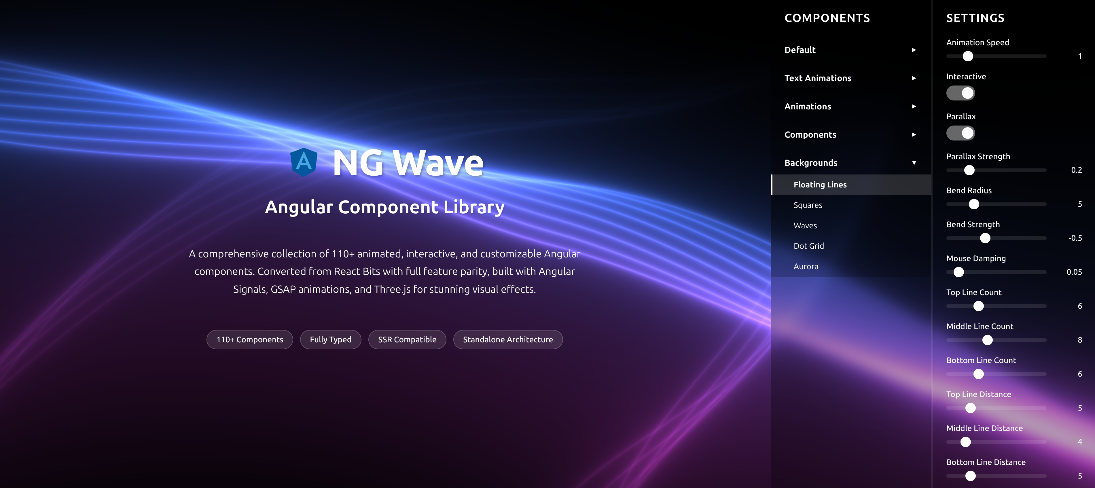
NG Wave
Angular Component Library
A comprehensive collection of 110+ animated, interactive, and customizable Angular components. Converted from React Bits with full feature parity, built with Angular Signals, GSAP animations, and Three.js for stunning visual effects.
Explore Components