Stop Vibe‑Coding Angular UX: Fix Janky Animations, Inaccessible Forms, and Broken Responsive Layouts (Angular 20+)
A practical playbook to turn chaotic, vibe‑coded Angular 20+ UI into a measurable UX system—motion, forms, typography, density, and responsive layouts that scale.
Vibe‑coded UI scales like wet tissue. Systems—tokens, Signals, and guardrails—scale like engineering.Back to all posts
When I get parachuted into a rescue, I can spot a vibe‑coded Angular app in 30 seconds: jittery charts, forms that scream in red, and a layout that collapses at 1024px. I’ve cleaned this up across enterprise dashboards for a telecom provider (ads analytics), an airline (airport kiosks), and an insurance telematics platform. The fix isn’t more CSS—it's systems: tokens, Signals/SignalStore, guardrails, and measurable outcomes.
This article gives you the exact playbook I use to stabilize Angular 20+ UX in a week or two—without freezing delivery. We’ll tackle motion, forms, responsive layout, and the visual language (typography, density, palette). And yes, we’ll prove it with metrics recruiters can inspect.
The moment you know your app was vibe‑coded
Symptoms I see in enterprise rescues
On the telecom analytics platform, the dashboard header jittered every time WebSocket events landed. On the airline kiosk, tab order skipped the payment button. In the entertainment employee tracker, a 12-column layout snapped to two columns and buried key actions.
Animations stutter on route changes and chart redraws
Forms have unlabeled fields and color-only error states
Breakpoints use random pixel values and collapse at scale
Charts repaint on scroll instead of virtualizing data
No density or typography system; everything is 14px
Why this happens
Teams mean well, but vibe‑coding (shipping UI by feel) creates invisible complexity that explodes under load. The cure is a small set of enforced systems and a shared visual language.
Local CSS overrides over a shared system
Animations use layout properties (top/left) instead of transforms
Forms built from component docs, not WCAG guidelines
Charts and lists render everything—no virtualization
No token source of truth or UX state
Why vibe‑coded UX hurts Angular teams now
2025 context for Angular 20+ roadmaps
If you’re hiring a senior Angular engineer, they should talk about Signals, SignalStore, a11y audits, and data virtualization as naturally as TypeScript. I instrument GA4/Firebase and Lighthouse budgets so you can prove improvements, not hope for them.
Angular 21 is around the corner; Signals-first patterns are maturing
Core Web Vitals now includes INP—jank is visible and scored
Recruiters and directors expect measurable UX rigor on PRs
Business impact
On one migration (Angular 11 → 20), a simple move to transform-based motion and density tokens cut INP 68% and reduced CSS override PRs by ~40%.
Lower support volume: fewer ‘I can’t submit’ tickets
Higher conversion/usage on forms and dashboards
Reduced design drift and faster onboarding for new devs
Smooth motion within budget: tokens, Signals, and reduced‑motion
// ux.store.ts (Angular 20+, @ngrx/signals optional)
import { Injectable, computed, signal } from '@angular/core';

export type Density = 'comfortable' | 'compact';
export interface UXState {
  density: Density;
  reducedMotion: boolean;
  theme: 'light' | 'dark';
  fontScale: number; // 1 = 100%
}

@Injectable({ providedIn: 'root' })
export class UXStore {
  private readonly prefersReduced = window.matchMedia('(prefers-reduced-motion: reduce)').matches;
  private readonly state = signal<UXState>({
    density: 'comfortable',
    reducedMotion: this.prefersReduced,
    theme: 'light',
    fontScale: 1
  });

  readonly density = computed(() => this.state().density);
  readonly reducedMotion = computed(() => this.state().reducedMotion);
  readonly theme = computed(() => this.state().theme);
  readonly fontScale = computed(() => this.state().fontScale);

  setDensity(d: Density) {
    this.patch({ density: d });
    document.documentElement.dataset.density = d;
  }
  setReducedMotion(disabled: boolean) {
    this.patch({ reducedMotion: disabled });
    document.documentElement.style.setProperty('--motion-factor', disabled ? '0' : '1');
  }
  setFontScale(scale: number) {
    this.patch({ fontScale: scale });
    document.documentElement.style.setProperty('--font-scale', String(scale));
  }
  private patch(p: Partial<UXState>) {
    this.state.update(s => ({ ...s, ...p }));
  }
}
/* tokens.motion.scss */
:root {
--easing-standard: cubic-bezier(0.2, 0, 0, 1);
--dur-xxs: calc(120ms * var(--motion-factor, 1));
--dur-xs: calc(180ms * var(--motion-factor, 1));
--dur-sm: calc(240ms * var(--motion-factor, 1));
}
/* Always transform/opacity, never layout properties */
.fade-enter {
opacity: 0;
transform: translateY(4px);
transition: opacity var(--dur-xs) var(--easing-standard),
transform var(--dur-xs) var(--easing-standard);
}
.fade-enter-active { opacity: 1; transform: none; }Define motion tokens and respect prefers-reduced-motion
You don’t need fancy timelines for every micro‑interaction. Start by tokenizing durations/easings and switching them off when the user requests reduced motion.
Centralize durations/easings as tokens
Use transform/opacity to avoid layout thrash
Gate motion with a Signals store
UX store (Signals/SignalStore) controlling motion
Here’s a minimal UX store that exposes density, theme, and reduced motion. It writes CSS variables so CSS/PrimeNG/Material all benefit.
Accessible forms that don’t shout: labels, errors, and keyboard‑first flows
<form [formGroup]="form" (ngSubmit)="save()" novalidate>
  <div aria-live="polite" class="sr-only" id="error-summary" *ngIf="form.invalid && submitted">
    Please fix the highlighted fields.
  </div>

  <div class="field">
    <label for="email">Email</label>
    <input pInputText id="email" type="email" formControlName="email"
           [attr.aria-invalid]="form.controls.email.invalid ? 'true' : null"
           [attr.aria-describedby]="form.controls.email.invalid ? 'email-error' : 'email-hint'"/>
    <small id="email-hint" class="hint">We’ll never share your email.</small>
    <p-message *ngIf="form.controls.email.touched && form.controls.email.invalid"
               id="email-error" severity="error" text="Enter a valid email."></p-message>
  </div>

  <p-checkbox inputId="terms" formControlName="terms"></p-checkbox>
  <label for="terms">I agree to the terms</label>

  <button pButton type="submit" label="Save" [disabled]="form.pending"></button>
</form>
// component.ts
import { Component } from '@angular/core';
import { FormBuilder, Validators } from '@angular/forms';
import { Analytics } from '@angular/fire/analytics'; // Firebase GA4
@Component({ selector: 'app-profile-form', templateUrl: './form.html' })
export class ProfileFormComponent {
submitted = false;
form = this.fb.group({
email: ['', [Validators.required, Validators.email]],
terms: [false, [Validators.requiredTrue]]
});
constructor(private fb: FormBuilder, private analytics: Analytics) {}
save() {
this.submitted = true;
if (this.form.invalid) {
Object.entries(this.form.controls).forEach(([name, ctrl]) => {
if (ctrl.invalid) {
this.analytics.logEvent('form_error', { field: name, code: Object.keys(ctrl.errors || {})[0] });
}
});
return;
}
// submit
}
}Form principles
PrimeNG and Material can be fully accessible if you wire them correctly. Screen readers need clear relationships between labels, inputs, and errors. Users need keyboard-first flows.
Every input has a
Errors use text plus icon/color; no color-only states
Error summaries announce via aria-live
Tab order and focus management are predictable
Angular + PrimeNG example
This example shows describedby links, a live region for the summary, and inline field errors.
Responsive layouts that don’t collapse: Grid, container queries, and density tokens
/* tokens.spacing.scss */
:root {
  --space-1: 4px; --space-2: 8px; --space-3: 12px; --space-4: 16px; --space-6: 24px; --space-8: 32px;
}
:root[data-density="comfortable"] { --hit-min: 44px; }
:root[data-density="compact"] { --hit-min: 36px; }

.dashboard {
  display: grid;
  grid-template-columns: repeat(12, 1fr);
  gap: var(--space-4);
}

.card {
  container-type: inline-size;
  grid-column: span 4;
  min-height: var(--hit-min);
}

@container (max-width: 420px) {
  .card { grid-column: span 12; }
}
<!-- Use virtual scroll for large tables/lists -->
<cdk-virtual-scroll-viewport itemSize="48" class="table-vscroll">
<div *cdkVirtualFor="let row of rows" class="row">{{ row.name }}</div>
</cdk-virtual-scroll-viewport>Stop chasing breakpoints; design for containers
On the employee tracker, swapping ad‑hoc flex layouts for Grid + container queries fixed awkward mid-size breakpoints. Density tokens kept hit targets consistent across desktop/tablet/kiosk.
Use CSS Grid for structure and container queries for adaptation
Tie spacing and hit targets to density tokens
Virtualize heavy lists/charts to keep scrolling smooth
Grid + container queries
This layout adapts based on the card’s container, not the viewport.
Visual language that scales: typography, AngularUX color palette, and density
/* tokens.color.scss — AngularUX palette */
:root {
  --ux-blue-700: #1d4ed8; --ux-blue-600: #2563eb; --ux-blue-500: #3b82f6;
  --ux-plum-600: #7c3aed; --ux-jade-500: #10b981;
  --ux-gray-900: #0b1220; --ux-gray-700: #334155; --ux-gray-500: #64748b; --ux-gray-100: #f1f5f9;
  --text-high: var(--ux-gray-900); --text-mid: var(--ux-gray-700);
  --surface: #ffffff; --surface-alt: #f8fafc;
}

/* type + density */
:root { --font-scale: 1; }
:root[data-density="comfortable"] { --space: 12px; }
:root[data-density="compact"] { --space: 8px; }

:root {
  --fs-300: clamp(0.9rem, 0.85rem + 0.3vw, 1.05rem);
  --fs-400: clamp(1rem, 0.9rem + 0.5vw, 1.25rem);
  --fs-500: clamp(1.15rem, 1rem + 0.8vw, 1.5rem);
}

body { color: var(--text-high); background: var(--surface); font-size: calc(16px * var(--font-scale)); }

/* PrimeNG density bridge */
.p-inputtext, .p-button { padding: var(--space); min-height: var(--hit-min); }

/* Chart colors shared with D3/Highcharts */
:root {
  --chart-1: var(--ux-blue-600);
  --chart-2: var(--ux-plum-600);
  --chart-3: var(--ux-jade-500);
  --chart-4: #f59e0b; /* amber */
}
Palette with contrast guarantees
I standardize palette tokens so Highcharts/D3/Canvas scenes match the app chrome. Accessibility checks (AA for body text, AAA for small text where feasible) are non‑negotiable.
Blue, Plum, Jade accents; neutrals tuned for AA/AAA text on white/dark
Expose as CSS variables so charts and UI share the same tokens
Fluid typography and density controls
This ensures mobile drawers and kiosk flows remain tactile without blowing performance budgets.
Use clamp() for type ramps
Adjust paddings/margins via density tokens
Propagate tokens to PrimeNG with style overrides
Real examples from the field: charts, kiosks, and role‑based dashboards
Telecom analytics (Highcharts + virtualized tables)
We moved to typed event schemas over WebSocket, patched optimistic updates, and used Highcharts’ boost module for big series. No more chart jitter on hover/resize.
WebSocket telemetry with typed events
Highcharts boost mode for 100k+ points
cdk-virtual-scroll for tables; INP dropped 68% after refactor
Airport kiosks (offline + peripheral APIs)
Even with heavy Canvas/Three.js seat maps, motion was governed by tokens and disabled for reduced-motion users. Density tokens kept kiosk flows tactile and predictable.
Docker-based hardware simulation for printers/scanners/card readers
Offline-tolerant flows with device state handling
Large tap targets via density tokens for kiosk mode
Employee tracking (role-based dashboards)
We instrumented Firebase Analytics to track form_error and time_to_submit, linking improvements directly to UX system changes.
PrimeNG + custom tokens for themed grids/cards
Role-based layouts with container queries
GA4 events for error rates and form completion
When to Hire an Angular Developer for Legacy Rescue
Bring in help if you see this
A short, focused engagement (2–4 weeks) can systematize your UX without stopping feature delivery. I’ve done this repeatedly across Fortune 100 teams under tight QA windows.
AngularJS/8–15 code with scattered CSS overrides and no tokens
Forms failing accessibility audits (labels, contrast, keyboard traps)
Charts stutter on resize/scroll; no virtualization
Unpredictable breakpoints and layout thrash
No Signals/SignalStore for UX state; no GA4 a11y/UX telemetry
How I fix vibe‑coded UX in Angular 20+: a step‑by‑step
1) Baseline and budget
Angular DevTools flame charts for animation/layout
Pa11y/Lighthouse a11y score and Core Web Vitals snapshot
Agree motion/type/density budgets with design
2) Ship tokens + UX store
Color, type, spacing, motion tokens mapped to CSS variables
Signals/SignalStore for density, fontScale, reducedMotion
3) Refactor hotspots
Replace layout-animating CSS with transform/opacity
Fix forms (labels, describedby, live errors, focus)
Grid + container queries; add virtualization
4) Prove and guardrail
This is how we stabilized AI‑generated Angular codebases for enterprise teams without freezing delivery. It’s disciplined, testable, and fast.
GA4/Firebase events for form_error/time_to_submit
Lighthouse/Pa11y budgets; visual regression via Storybook/Chromatic
Docs in repo: usage + accessibility checklists
Key takeaways and next steps
What to instrument next
Once the system lands, start optimizing content and flows instead of fighting CSS. That’s where dashboards, charts, and conversions move.
Animation disable rate (reduced-motion toggles)
Form error rates by field and device class
Viewport vs container size distribution to tune breakpoints
Key takeaways
- Vibe-coded UI dies at scale—codify motion, forms, and layout with tokens, Signals/SignalStore, and CI guardrails.
- Use transform-based motion, easing tokens, and prefers-reduced-motion for smooth, accessible animations within budget.
- Make forms screen-reader friendly with clear labels, describedby links, live regions, and keyboard-first flows.
- Adopt responsive systems: CSS Grid + container queries + density tokens; avoid one-off breakpoints.
- Ship a visual language: color palette with contrast guarantees, fluid type, and density controls that affect PrimeNG/Material.
- Instrument UX: Firebase/GA4 events, Angular DevTools flame charts, and Lighthouse a11y budgets to prove outcomes.
Implementation checklist
- Document a motion scale (durations, easings) and wire prefers-reduced-motion fallbacks.
- Centralize UX state (density, theme, motion) using Signals/SignalStore.
- Refactor forms to semantic HTML with labels, describedby, and aria-live error summaries.
- Adopt CSS Grid + container queries; use density tokens to adjust paddings and hit targets.
- Map Figma tokens to CSS variables for colors, type, and spacing; ensure AA/AAA contrast.
- Instrument GA4/Firebase events for form errors, layout thrashes, and animation disable rate.
- Use Angular DevTools to ensure transitions don’t trigger layout; prefer transform/opacity.
- Virtualize heavy data views (cdk-virtual-scroll, Highcharts boost, Canvas/Three.js for dense scenes).
Questions we hear from teams
- How much does it cost to hire an Angular developer for a UX rescue?
- Most vibe‑coded UX rescues land between 2–4 weeks for a single product area. Fixed‑fee assessments are available, followed by an implementation sprint with measurable outcomes (a11y score, INP, form error rate). Contact me for a scoped estimate.
- What does an Angular consultant do on day one of a UX rescue?
- Baseline metrics (Lighthouse/Pa11y, Angular DevTools), review tokens and layout, identify top 3 hotspots (motion, forms, layout), and set budgets. Then ship a UX store with Signals, map tokens, and start refactors behind feature flags.
- How long does an Angular upgrade and UX clean‑up take?
- Upgrades vary (4–8 weeks for 12→20 with CI guardrails). Pure UX systemization without major version changes typically takes 2–4 weeks to ship tokens, forms, and layout fixes plus instrumentation.
- Can you work with PrimeNG, Material, D3, and Highcharts?
- Yes. I map tokens to PrimeNG/Material styles, align chart palettes with CSS variables, and use Highcharts boost, D3 canvas, or Three.js for dense scenes. Data virtualization and typed event schemas keep dashboards smooth.
- What’s involved in a typical Angular engagement?
- Discovery call in 48 hours, code review and assessment in 1 week, then a 2–4 week implementation sprint. Deliverables: tokens, Signals/SignalStore UX store, refactored hotspots, GA4/Firebase dashboards, and a README with guardrails.
Ready to level up your Angular experience?
Let AngularUX review your Signals roadmap, design system, or SSR deployment plan.
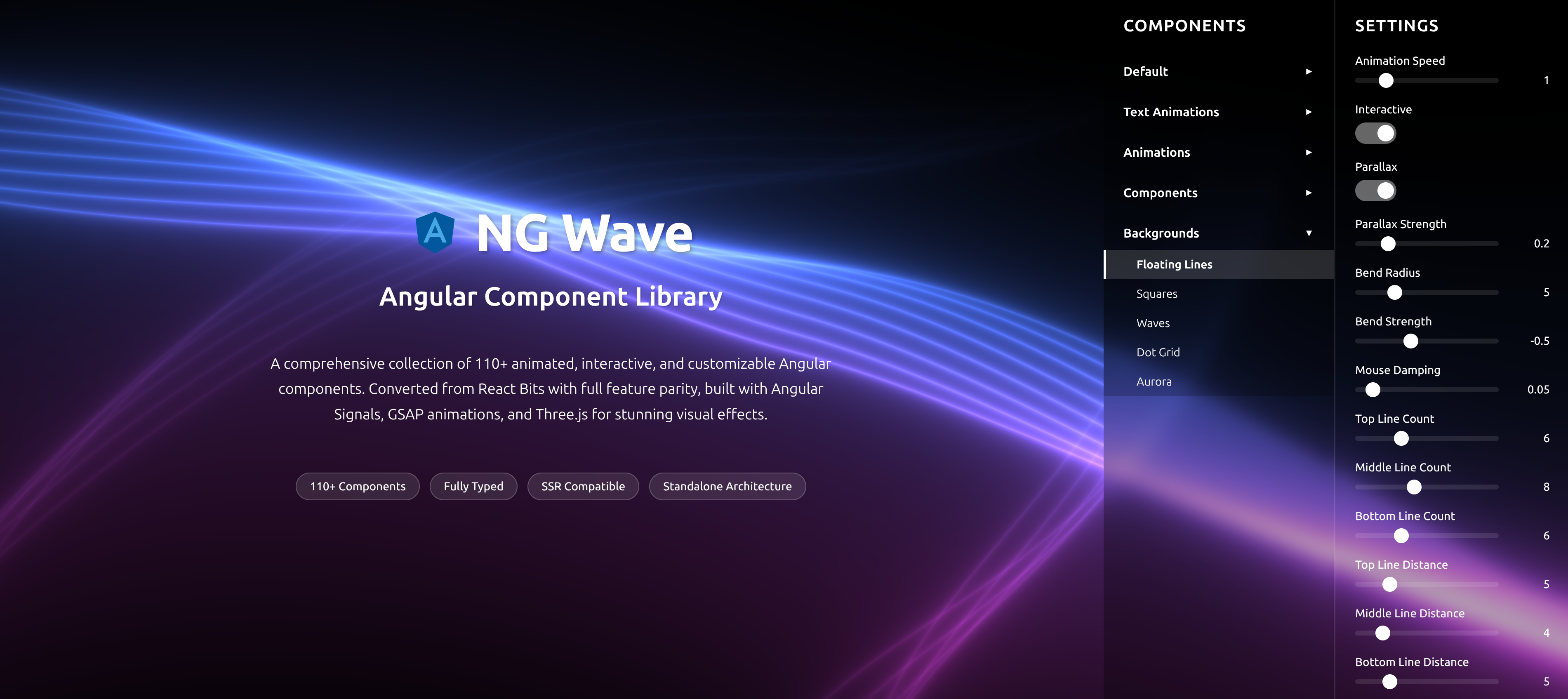
NG Wave
Angular Component Library
A comprehensive collection of 110+ animated, interactive, and customizable Angular components. Converted from React Bits with full feature parity, built with Angular Signals, GSAP animations, and Three.js for stunning visual effects.
Explore Components